Style Points
I don't need to tell you this was one of the craziest years that anyone of us can remember. And while there's no promise that 2021 will be any better, there's something symbolic about saying goodbye to 2020. While I could wrap things up by talking about how this year's insanity created all sorts of issues for the sport of cricket or how the sport helped us deal and cope with everything that was going on around us, I think I'll leave that to folks who know more about the breadth and scope of the game than I do. Instead, I'm going to discuss something no less important: who had the best and worst T20 uniforms of 2020.
First off, this is one of the least scientific discussions of all-time. I have no background in fashion or clothing design. And if it weren't for accidents involving mustard, I'd be perfectly happy wearing the same t-shirt and jeans 365 days a year. I'm writing as a sports fan…and an American sports fan, so it's being filtered through the brain of someone who's seen tons of baseball, football, basketball, and hockey uniforms -- but not a whole mess of cricket uniforms. As a result, the things that scream "cool jersey" to me may not be the same things that scream "cool jersey" to you.
That said, here -- in no particular order -- are my Top Three…

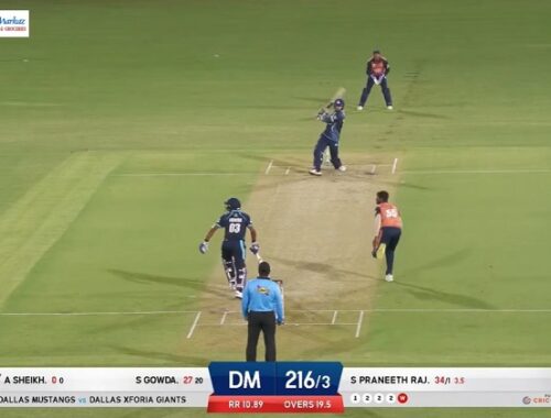
Kings XI Punjab -- This is just a really clean and simple look. The red is a bit bolder than a traditional fire-engine-red -- it's similar to the red of the Arizona Cardinals -- and that makes it stand out a bit. There's nothing over-the-top or extraneous here. It's as pure a look as you can have on a jersey that's covered with ads for detergent and a financial exchange service.

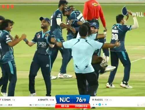
Trinbago Knight Riders -- Very similar to the look of baseball's Diamondbacks jersey (which I don't really like), but here it works. The dark red blending into -- and then slightly out of -- black is pretty cool, as is the overall textured look of the material. Similar to the KKR jerseys from the IPL, but the red just looks better than the purple. My biggest regret in life is not buying a TKR jersey when I saw them play in Florida in 2018.

Karachi Kings -- A super tight look with a classic red and blue scheme. What puts this over the top is the addition of the splash of yellow. Three colors could end up looking like a Jackson Pollack painting, but the yellow here is in just the right proportion to the red and blue. And not only is it in the right proportion, it's also in the design of a lion's head! A double bonus!
And -- in no particular order -- the Bottom Three…

All BBL Uniforms -- Sorry, but the same-color shirts and pants makes for a really boring look. The NFL experimented with this idea with its "color splash" look and when you have two teams dressed like this, the TV screen looks like a Leroy Neiman painting. And that's never a good thing. Without a contrasting color, uniforms look flat and uninspired. Darkness defines light and without evil there is no such thing as good. By the same token, without a contrasting hit of blue or yellow, even the otherwise funky pink Sydney Sixers jersey/pants combo seems pretty blah.

Mumbai Indians -- Again, sorry. I realize this is one of the most popular sports teams on the planet and I probably wouldn't be watching cricket -- let alone running a cricket website -- had it not been for Lasith Malinga and Kieron Pollard, but I'm just not into the shiny, gold lamé look and the faux military-looking epaulets. While they may be the dominating team in the IPL, their unis are a little too Vegas for me.

Lahore Qalandars -- Neon lime-green and gray doesn't make for the most striking color combination. The gray kind of sucks all of the life and electricity out of the green. Also, not a fan of the fake V-neck look. Make up your mind -- either have an actual V-neck or don't. It's not a life-or-death decision, but you shouldn't be allowed to ride the fence on it.
These choices are obviously my own opinion and are based exclusively on my favorite colors, shapes, and whatever personal issues that I'm currently going through. Let me know what you think.
And thanks for paying attention to what I'm doing. From the beginning, the goal of CricAmerica has always been to introduce and explain the sport of cricket to sports fans in this country who may not know a whole lot about it. It's been incredible to get to interact with so many people who share that same vision.
We somehow made it through 2020 and all we can do is hope that things get better in the coming days, weeks, and months.
Best wishes for a prosperous, healthy, and color-coordinated 2021!
© CricAmerica.com 2020